Showing posts with label Mickey Font. Show all posts

Tuesday, October 4, 2011

Halloween - Meet the Flinstones Layout

Hello everyone!  I hope you enjoyed my Disney Week posts and I'm happy to have a couple new followers.  Today I want to share a layout that I just made and I really love.  I haven't scrapped a lot of my Halloween pictures from the last two years, so I tackled the 2009 pics this week.  I am drawn to Halloween papers and embellishments, I keep buying more, even though I already have a ton.  But I recently bought the new DCDW Halloween stack and I LOVE it!!  This layout features it.  Now, if you know me, or as you can see by my title, I can't be without my pop dots - they are an essential.  One of the things I love to do with really pretty patterned paper when I have two of the same paper is cut the patterns out of one of them and pop it on the other of the same paper to give it some great dimension.  I did this with the entire right side of the layout.  So here is the Modern Stone Age Family....


The title is from Mickey Font.


Here is a better view so you can see the dimension and how most everything is popped!


Here is the double page layout side by side:

I'm entering this in the following challenges:
Frosted Designs - Fussy Cutting (and I sure did on this layout!)
She's a Sassy Lady - Just create!

I also want to let you know that one of my favorite challenge blogs, Whimsical Wednesdays is having a Halloween Blog Hop on October 7th (you can see the badge on the top right of my blog) and I'm excited to see the creative things their team comes up with!  

I have some more Halloween layouts to share this week so be sure to come back soon!
Thanks for stopping by!

Monday, October 3, 2011

Disney Layouts - Part 6 - The Last Part of the Disney Album

Hello everyone!  My Sunday got complicated yesterday, so I wasn't able to post.  Today, I decided to finish off DISNEY WEEK and show you the rest of the layouts in the Disney Album.  So this will be a very long and PIC HEAVY post!!!  But I think it will be worth it, so keep reading! 
If this is your first time here at my blog, be sure to check out the other Disney Layouts by either reading the older posts below or click the Disney label on the right side (or you can simply click HERE and see all of the Disney layouts).  I would love to know if you've enjoyed this themed week of layouts, so be sure to comment and let me know you were here and what your favorite layout(s) was!

Let's start with this first one, which is all made with the Mickey Font cartridge (a must-have and one that I use probably most often for fonts).  I love the font, but it also has all of the basic characters and some other neat features like the tag, ticket, and license plate.  Here it is with closeups...


Here are two single page layouts, one for each ride in Magic Kingdom.  The first one includes the merry-go-round cut from the Carousel cartridge.  The title is from Baby Steps and Cuttin Up, which are glittered. 


I can't remember a lot of the details from the layout below, but the title is from Mickey Font.


I really love this layout below because I was able to take the idea in my head and create it in my gypsy.  I wanted it western and with a rope, so I found Howdy pre made on Create a Critter and the badge.  I then replicated the look to create "Partner" using Lyrical Letters cartridge.  Now the border was quite a find!  It is from Stretch Your Imagination under the Card Frame feature.  It cuts in a square, but I cut it to create the continuous border across both pages.  The characters are from a sticker sheet, which I put on card stock and then cut around and popped (of course, lol!).


I also added some lines to make the title look like rope, see here:


This layout is scrap lifted, but I don't remember from where and the file is on my stolen computer :(


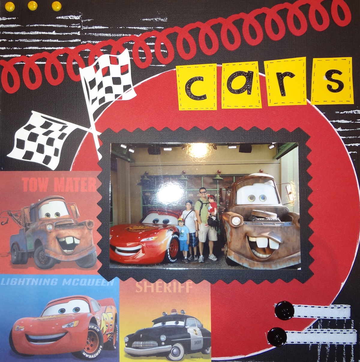
This layout is also a cool one, I think.  I distressed it some with some rippled cardboard and white paint.  "Start your Engines" is from the Cars cartridge, as are the flags.  I created the title by creating irregular squares (which I doodled around) and placing the letters (from Cuttin' Up) in each one.  I made the large, red loop border by welding a ton of cursive l's!  Here is the layout with a close up of each page...


This is the last page of the album, like a hodge podge of left over pictures.  I had this great sticker sheet with a ton of banners and I wanted to use all of it, so I did as my left side border of the page.  The top corner is a felt pre made border, which I cut to create the corner effect.  


For the trip, I had created an Autograph Album for my kiddos with my Bind-It-All machine which they used throughout the trip.  I wanted to put it in the album in a way that you could flip through it to see all of the autographs.  I decided to create this on the inside of the back cover of the album.  I used this pattern paper with all of the signatures (how appropriate, huh!) and then placed the autograph album on top.  


Wow, that was a really long post!  I hope you've enjoyed DISNEY WEEK here at ScrapSticklePop.  If you've enjoyed it, please be sure to leave me a comment below and let me know what your favorite layout(s) was.  You can also post or pass along a link to my blog to your other bloggy friends who might like to see it!

I'm also entering some of these layouts in the following challenges:
Crafty Chics - Disney Pixar Link Up Party
Whimsical Wednesdays - Anything Goes
Passionately Artistic - Linking Party
You Had Me at Craft - Linking Party


Thanks for stopping by!
Be sure to stop by tomorrow as I get into the Halloween spirit!

Saturday, October 1, 2011

Disney Layouts - Part 4 - with a Must See Disney Characters Page!

Hello everyone!  The end of my week got crazy, so I couldn't post these last two days, which just means I have more to share today!!!  The first layout is another one of my favorites and it took a lot of time to complete.  The Mickey & Friends cartridge is absolutely adorable, but I wouldn't even have bought it without a gypsy because there are so many layers for each character and some of the pieces are so incredibly small!  So After I designed what I wanted the layout to look like, I then started using the layers feature on the gypsy to separate all the pieces for each character by color to simplify the cutting process.  For the bottom, I welded all of the hands to create the border.  Finally, for the title, I welded the little tags and the "I heart Disney" I hand wrote and then stickled on top.  Below is the layout, followed by a close up of each page and then the layout with the pictures inside it.


Here are more layouts from my Disney Album...


This is from Animal Kingdom.  I used Create a Critter for the giraffe.


I'm linking the characters page to the "Anything Goes" challenge over at Scrapalicious USA.  

I hope you're enjoying "Disney Week" here on my blog (if you haven't seen the other layouts, keep scrolling after this post or click on "older posts" to see all the rest!) and hopefully, I've inspired one or two of you!  I'd love to hear what some of you think, so be sure to leave a comment!
Thanks for stopping by!  I have more to share tomorrow, so be sure to come back!


Tuesday, September 27, 2011

Disney Layouts - Part 2 - Buzz Lightyear Layout

Hello everyone!  Today I want to share my favorite layout from the Disney Album.  When I first started the layout, I didn't know where I was heading with it, I just had two of the same paper and I knew I wanted to pop the Woody and Buzz, but didn't know what else I was going to do with it.  I used the green Bo Bunny Dot paper to break it up in the middle and cover the part where I cut out the characters (which I popped on the other side) and put my action shots there in the middle.  I also had a great picture of Buzz on the left that I wanted to use.  I created my title using Mickey Font (if you don't have this cartridge, it's a Must Have!) and welding it (of course!) on my gypsy.  Since the ride in Disney is shooting targets, I decided to create the targets and introduce a new color to the mix, which I think really brought it all together.  Just when I thought I was done, I added stickles from the laser guns in the pictures to the targets I had made and that just took it over the top for me!  I hope you like it!!


Stop by again tomorrow for more Disney Layouts!
See you then...

Tuesday, February 15, 2011

Buzz Lightyear Party - Part 1

Hello everyone!  Not a lot of time today to post, but wanted to share a couple of the things I made for my son's birthday party this weekend.  I haven't even had a moment to upload all the pics, but hope to this week so I can share some other things, especially the AMAZING cake that my friend Marylin brought to the party.  I kept it simple for this party, it was at a park and I wanted a sign for the entrance.  So my husband brought me an outdoor sign which I covered with blue poster board and then I created the "Welcome Space Rangers..." sign for the entrance to our pavilion.  To make the green letters pop, I stitched them with my white pen.  I used Mickey Font (a definite fave!) and Accent Essentials for the starburst under the 5th.  Here it is...


So excited to share this, my very talented nephew drew this from scratch!  I wanted to create a game for the party and my nephew came up with this idea to draw Zerg (the nemesis of Buzz Lightyear) and then have the kids shoot at him (like the Buzz Lightyear ride at Disney).  He did such an impressive job on this!  We then found a target clip art that worked perfectly, which we popped onto Zerg.  Isn't this great?!


I realized after I sent the invitations that I hadn't indicated which pavilion we were in, so I made another sign, although not as cute as the welcome sign, to place in front of the park for people to see when they got to the park to know where to go...


If you didn't get a chance to see the invites I made for the party, you can check them out (as well as a little gypsy tutorial on how I made them) HERE.

Oh, I almost forgot, I made the Chirp again, with my Tiny Dancer layout - it's the featured picture!  Woohoo!  You can check the newsletter HERE and you can check out my blog post with closeups of my Tiny Dancer HERE.

I hope to be able to upload more pictures tomorrow so I can share more pics of the party.  I hope you come back by to check them out.  
Thanks for stopping by!

Wednesday, February 9, 2011

Thank You Frame

Today's post is full of THANK YOUs - first thank you for all the wonderful and sweet comments on my Love Bug layout and gypsy tutorial (hope you all are enjoying those!).  I loved reading them and reading about people's favorite cartridges.  Another thank you to my new followers!  So glad to have more people following me on my scrappy journey!

I lead a very busy life (which is an understatement, lol!) and I'm a full time teacher so when I'm not creating for myself, I'm usually creating in my classroom or for my classroom, or with my students or for many of the additional activities that I coordinate or participate in.  I love that I'm now able to share many of these other creations here on my blog!  

I teach a Law Studies elective and we recently had the privilege to visit the courthouse and were treated like V.I.P.s!  It was absolutely wonderful and before we left, we took a group photo with the judge.  Instead of just sending her the photo via email, I wanted to do something special for her.  So I created a layout that I framed to send to her.  On the back, all of the kids signed it and they also wrote letters that we will send in an envelope along with this frame.  Take a look...


Two weeks ago, we had a tragedy strike our city with two police officers being shot and killed in the line of duty.  In honor of their lives and service, as well as for all others who risk their lives to keep us safe, my students and I created a commemoration banner.  Everything is student-made, including the amazing badge in the middle which my very talented students drew from scratch (it started out as a blank piece of paper - it is quite impressive).  Each of them created a tile to honor the two officers, which forms the interior border.  Above and below the badge are the names of all of the officers that have been killed in the line of duty in Miami-Dade County.  My students came up with the saying and I welded it in my gypsy.  We cut it out (I have my small cricut in my classroom) and added the hearts at the top as a finishing touch.  Take a look...


Just like police officers where the black and blue band over their badge when one of their own has passed, we added one to our badge out of respect, as well...


So today's post is a little different, but I'm always creating (even though it's not always traditional scrapbooking) and I wanted to share a different side of me.  

Thanks for stopping by!

Thursday, January 27, 2011

A Different Kind of Scrapping...

Wow, have things gotten busy around here!  So I haven't had a moment to scrap - in the traditional sense - but I have been busy creating all sorts of things.  Mostly school related and a lot of preparing for my son's 5th birthday - busy, busy, busy!  So I wanted to do a quick post (and yes, I am very aware of the time - it's when I do my best work, lol!) to show you all what I've been up to the last couple days.  I can't show you the invitations of my son's birthday yet because they are going to be mailed tomorrow and I don't want to ruin the surprise, but I can't wait to post them next week!  I will, however, show you some of the school projects...

Last week I was chaperoning a trip to Disney.  Now my group of kids is really special and I wanted us all to look the same, so I bought t-shirts and my nephew helped me design and iron them on.  I loved the way they turned out and the kids loved them too! (We were the only ones that had matching shirts)

I couldn't get the picture below to rotate, so you will have to turn your heads to see the design close up.  For years now I've had a name for my groups along with a symbol and chant.  It's all really fun, but the two C's you see is the symbol.  


This is the back of my shirt...


Next is a vinyl project (my love for vinyl continues!).  At my school, we have a themed Gallery opening every 2 months where we feature paintings and artwork as well as student work.  Tonight we had a gallery opening called...

Now, the frames are not from the Cricut, our Media Specialist had those.  But everything else is Cricut, of course!  The title is a play on words (instead of Past Tense, Past Tens, since its all about the decades). I created it with my gypsy. I used Plantin Schoolbook, Cherry Limeade and Gypsy Font - all welded, of course!

Finally, tonight my sister needed to create a poster to hang in her classroom tomorrow, so again it was time to create.  I used my go to font for school - Mickey Font - and welded it on my gypsy.  For this I added a lot of texture.  You will see below...


So although I haven't actually scrapped, I've done quite a bit of creating!  
I hope you've enjoyed seeing what I've been up to.  I hope to have a layout to share by this weekend since I will be cropping with my friends.  
Thanks for stopping by and come back soon!

Related Posts with Thumbnails