Monday, January 31, 2011

Layouts for a Cause - FCCB DT Project

This week at Fantabulous Cricut we are creating projects for a cause.  So today I have my DT project to share as well as two other layouts based on this.  This was a great challenge for me because it forced me to really have to think of how I was going to use my cricut on this.  The other two layouts that I will show you after do not use the Cricut at all (I know, big shocker, coming from me, lol!).  So I decided to scrapbook the pictures from an event my nephew helped coordinate that I got involved with and involved my students in called "Run for Respect" which was aimed to raise money and awareness for fighting domestic violence/abuse.  I knew I wanted to use Don Juan for the title, it just fit.  Now for the embellishment, I wanted to use sneakers, but I wasn't sure where to find the ones that would work with this page in my wide variety of cartridges.  This is when I went to the trusty cricutsearch.com and it showed me the perfect ones on a cartridge that I of course own but haven't really used much, Paisley.  So the layout came together very quickly after that and I really love the results.  Now take a look...


Since this week we are creating for a cause, I also wanted to share two other layouts of mine with the same theme.  The first is one for breast cancer in honor of my cousin...


The other is another cause that is dear to me, finding a cure for autism.  Two years ago my students raised over $1000 and we all took part in this event together...


So I hope you're inspired to create for a cause this week.  Each of us has something that is dear to us, so create a project and be sure to link up to Fantabulous Cricut this week!

Thanks for stopping by!
Have a great week everybody!

Sunday, January 30, 2011

Tiny Dancer

Hello everyone!  I've got a super-duper cute layout to share today.  I have these fantastic pictures of my daughter in her first tutu (thanks to Marylin who put it on her as soon as she saw it!).  I had been waiting to do this page for a while now, but didn't quite have the inspiration.  About a week and half ago, Jean from Jean's Crafty Corner, a blog I follow regularly, had created a layout with the cute ballerina.  It reminded me that I had an unopened fantastic cartridge, Twinkle Toes, that would be perfect for this layout.  I matched my doll to my adorable daughter, with the dark hair, the outfit and I even used tulle to create the "tutu".  The title is from Once Upon a Princess and I love that it has little accents (like a little tutu and bows) on the title.  I love the way this turned out and it made the wall - my hubby already put it up and everything!  So here it is....


I also wanted to share an awesome resource with you all that I recently discovered - its Cricutsearch.com
Whenever you are looking for an image and you don't remember which cartridge has it, it will not only tell you the cartridge, it will even give you a screenshot of where in the handbook it can be found.  I've found it really useful and wanted to share the tip!

Tomorrow I have another great layout to share, that I'm putting the finishing touches on now.
Hope to see you back then!
Thanks for stopping by!

Thursday, January 27, 2011

A Different Kind of Scrapping...

Wow, have things gotten busy around here!  So I haven't had a moment to scrap - in the traditional sense - but I have been busy creating all sorts of things.  Mostly school related and a lot of preparing for my son's 5th birthday - busy, busy, busy!  So I wanted to do a quick post (and yes, I am very aware of the time - it's when I do my best work, lol!) to show you all what I've been up to the last couple days.  I can't show you the invitations of my son's birthday yet because they are going to be mailed tomorrow and I don't want to ruin the surprise, but I can't wait to post them next week!  I will, however, show you some of the school projects...

Last week I was chaperoning a trip to Disney.  Now my group of kids is really special and I wanted us all to look the same, so I bought t-shirts and my nephew helped me design and iron them on.  I loved the way they turned out and the kids loved them too! (We were the only ones that had matching shirts)

I couldn't get the picture below to rotate, so you will have to turn your heads to see the design close up.  For years now I've had a name for my groups along with a symbol and chant.  It's all really fun, but the two C's you see is the symbol.  


This is the back of my shirt...


Next is a vinyl project (my love for vinyl continues!).  At my school, we have a themed Gallery opening every 2 months where we feature paintings and artwork as well as student work.  Tonight we had a gallery opening called...

Now, the frames are not from the Cricut, our Media Specialist had those.  But everything else is Cricut, of course!  The title is a play on words (instead of Past Tense, Past Tens, since its all about the decades). I created it with my gypsy. I used Plantin Schoolbook, Cherry Limeade and Gypsy Font - all welded, of course!

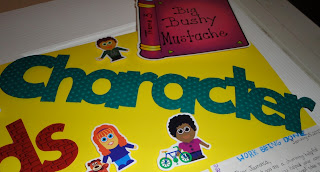
Finally, tonight my sister needed to create a poster to hang in her classroom tomorrow, so again it was time to create.  I used my go to font for school - Mickey Font - and welded it on my gypsy.  For this I added a lot of texture.  You will see below...


So although I haven't actually scrapped, I've done quite a bit of creating!  
I hope you've enjoyed seeing what I've been up to.  I hope to have a layout to share by this weekend since I will be cropping with my friends.  
Thanks for stopping by and come back soon!

Friday, January 21, 2011

Bling - Sofi's Baptism Layout


Today I wanted to share a layout I made for my sweet Sofi's Baptism.  I used one of the decorations that I had created for her baptism reception as the title for the page.  On the bottom of the right page is my copy of a word book I created for each guest filled with pictures of my daughter.  The best part is that on the back of the little book I made for each guest, I added a picture of each guest carrying my daughter just minutes before during the baptism (I LOVE my HP portable printer!!) and handed it to them at the reception.  
For this layout, I wanted soft colors for the page and I stuck with pink and white.  You can't really tell in the photo, but the background paper is pink with white polka dots.  There is lots of bling throughout this layout, you will see in the closeups.  I'm entering this layout in two challenges this week, the "bling" challenge at My Sheri Crafts and the 3 flower challenge at Cooking with Cricut.  


I also wanted to share that I made Top 3 at Frosted Designs for last week's challenge and I now have a new blinkie!  Woohoo!
Frosted Designs

Thanks for stopping by!
Hope you come back soon!

Tuesday, January 18, 2011

Cupcake Cutie

Since this week at Fantabulous Cricut we are having a "Sweet Shop" challenge, I wanted to share another "sweet" layout I created featuring some good enough to eat cupcakes and my cutie.  The page matches her outfit (this time, on purpose! LOL!), even part of the title (which I handwrote to match).  Now the cupcakes have a lot of detail and dimension (it's all about Scrap-Stickle-Pop!).  They are from Doodlecharms.  I cut off the candle and added my own cherry.  They are shadowed in red, the "wrappers" are crinkled like actual wrappers, the "frosting" is from velvet/flocked paper, which I also embossed with stars - some which I stickled, others which I blinged.  I really wanted to make the cherries pop, so I added red beads to them and created the stems with scraps.  The pictures speak for themselves, she is definitely a CUTIE!  So here is the layout...


I also wanted to let you know that another Fantabulous Cricut Crawl - this one will be "Share the LOVE" is coming soon!  


Fantabulous Cricut

Hope you all have a great week!  Come back soon to see more projects!
Thanks for stopping by!


Monday, January 17, 2011

Sweet Shop Challenge - FCCB DT Layout

Hello everyone!  This week at Fantabulous Cricut we are having a Sweet Shop challenge.  I knew exactly the pictures I wanted to scrap for this challenge, my daughter enjoying her first popsicle by herself.  It was also a great time to explore one of my new cartridges, Simply Charmed, which is simply adorable!! Its a more whimsical version of Doodlecharms, in my opinion.  I'm thinking I might need to get me some more Peachy Keen stamps to go along with this cartridge, but we'll see.

So since my daughter was eating a popsicle and had popsicles on her shirt (I swear I didn't plan this, even though my friends are probably laughing right now, saying "yeah, right!" lol!) I had to make that my large embellishment.  Finding the paper, was really the most time consuming part (isn't it always, though).  But when I found a great coordinated set from K&Company "Berry Sweet" line from a while back that I had in my stash, it just worked with the pictures!  I also had a leftover embellishment from that line that said "sugar" (how appropriate!) and really that's when it all came together.  So now take a look at the finished layout...


I used really glittery doodlebug paper that I've had stashed and saved for a while for the popsicle and an actual popsicle stick. 


I hope you've enjoyed this "sweet, yummy" layout.  Come back again tomorrow for another "sweet" layout that I have to share with you all featuring my adorable cupcake cutie.  
Have a great start to your week (I know I will, a holiday and day off, woohoo!)...
Thanks for stopping by!

Thursday, January 13, 2011

Birthday Layouts

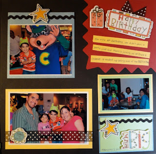
This past weekend, one of my group of friends came over to scrapbook and we had a super fun crop at my house.  I started the day finishing some layouts from a while back that went perfectly with my son's 4th birthday pictures.  Here is the original layout, before pictures...


Here it is with pictures...


Of course, all embellishments are popped!


We had a little birthday party in his class at school on his last birthday, so I decided to create a collage of all the pics from his class to add to this layout.  


Thanks for stopping by!

Wednesday, January 12, 2011

80s - Cricut Style

My niece is an RA for her dorm and every semester she needs to decorate her residents doors and the bulletin boards on her floor.  This semester, she was given an 80s theme.  So we started brainstorming what she could create to use for her doors (she has 45 residents, so it's a lot of preparation).  But since I have my gypsy, I knew we would be able to figure it out.  

First we came up with a boombox.  I created it from shapes on the George cartridge (I use this cartridge sooooo much!).  I welded a rectangle and mini rectangles to create the handle for it.  I then cut two circles out of black paper to make the speakers.  It came out cute, but it just didn't have that "it" factor.  Then we came up with Pac-Man.  So this time I made a large circle to fit a whole sheet of paper and then I turned a triangle on it's side and didn't weld the two, because I wanted to create the mouth.  A small black circle and voila!  But the even cuter part were the ghosts!!!  Now, I really had no idea how I was going to make this, but I was confident that I'd find a way to figure it out.  After lots of searching, I found the perfect shape on my new Simply Charmed cartridge.  I stretched it to create the top part and body of the ghost.  But for the bottom, I needed sort of a pinked edge. So I welded three triangles together and lined them up at the bottom of the shape I had stretched (without welding) and they came out just like the ghosts!  My niece then cut them from all the colors (just like in the game!).  

So I wanted to share the pictures because they came out so cute.  I would have photographed my gypsy to show you how I made the file, but it is super late and I haven't done it yet, so you'll have to excuse me on that one.  If anyone really wants to see it, leave me a comment and I'll try to add it later.  Take a look at the finished product...


Thanks for stopping by!
Hope you come back soon!

Monday, January 10, 2011

Winter Fun - FCCB DT Project Challenge "Winter Warmies"

This week over at Fantabulous Cricut there is a "Winter Warmies" challenge.  Now, since I live in Miami, that is a challenge in of itself since we don't really have winter, but luckily, I just got back from a great family vacation staying at a cabin in North Carolina and I have some awesome winter photos with snow!!! Since we were completely bundled up in all the pictures, all of them worked for this challenge, I just needed to pick a theme for my layout.  I decided to focus on one of the most fun parts of our trip - sledding!  Throughout our trip I was just thinking about all the cute layouts I could make with the super adorable "Winter Frolic" cartridge and it helped me create the layout below.  Oh, I cannot wait to make more layouts using this cartridge! There is A LOT of dimension on this layout!  Just look for yourself...

The whole bottom part of the layout is recreated "snow" using cotton, which I added some glitter to make it sparkle.  The title and super cute boy embellishment (which I made to match my son!) are popped, of course!!  I arranged the pictures slanted to recreate the "downhill" feel of the sledding.

This title has a lot of dimension and sparkle to it, but this picture still doesn't do it justice.  First I flocked the "Winter" part and then I used some doodlebug glitter for the "fun".  I didn't feel the "winter" word was sparkly enough, so I added another layer using MS fine glitter and another brand fine glitter that I sprinkled on the rest.  

Other adorable embellishments with a journaling tag...

The cuffs are flocked and I used MS drippy goo punch as a border on the right page.

Another close up of my boy on the sled...

I hope you join us this week at Fantabulous Cricut for our "Winter Warmies" challenge, too!

I will also be adding this layout into the Frosted Design challenge this week of using 3 or more photos on a layout.  

As always, thanks for stopping by!  
Be back soon because I have a couple more layouts to share this week!
Have a great week, everybody!

Related Posts with Thumbnails